PROBLEM
The Qualiti Portal was not created for users - it was created for internal use.
The original Qualiti Portal was written by the first software engineer who was hired at Qualiti. The primary intention was to build it quickly so it could be shared internally with stakeholders. It was built using many prebuilt components and tables and did not factor in a user's perspective and needs.
The Portal was created with two views. There was the Client View, which is what future users would see, and there was the Super View, which is what internal users would see. The Super View was thought of as the "main view" and all new features were added there and then later adapted for the Client View if needed, which often meant that the user was thought of last, if at all. When it came time to sell to customers, they were not able to understand how to use the Portal and had to have a lot of assistance from Qualiti.
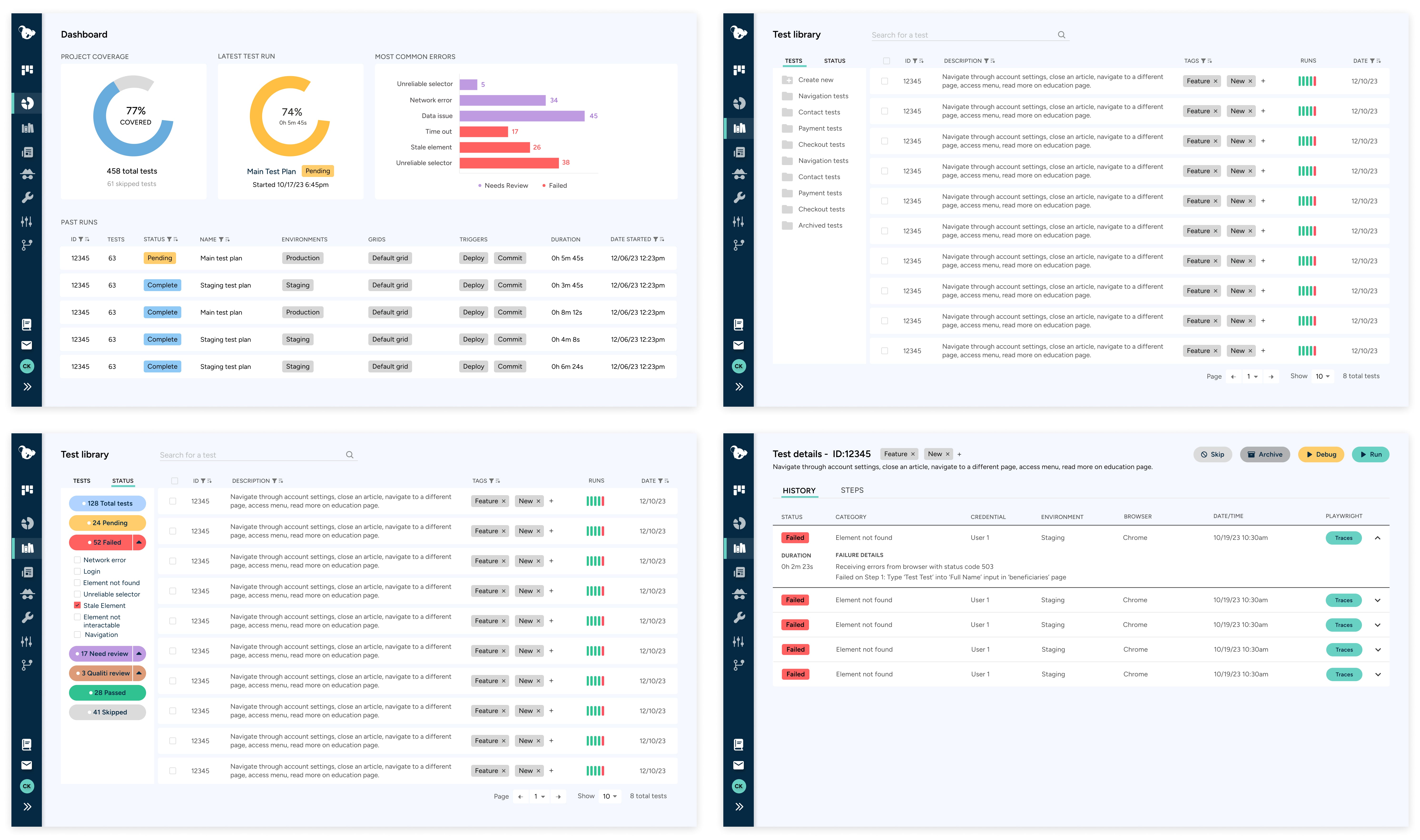
BEFORE
SOLUTION
Recreate the user experience by prioritizing their needs and perspectives.
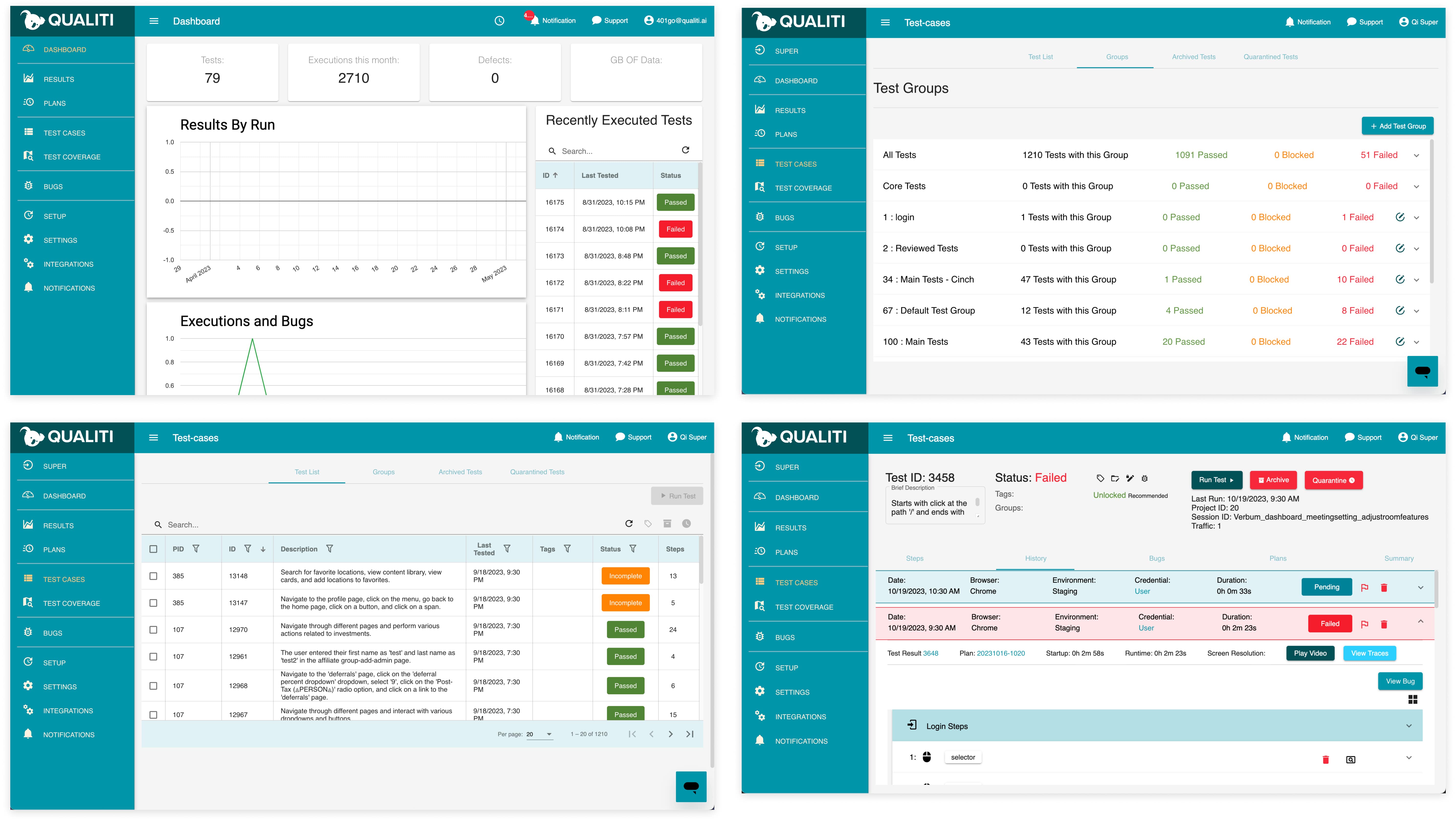
The Client View went through a full redesign that now prioritizes the user experience. It has a clear end user and has a simplified user journey resulting in users being able to use the product on their own.
AFTER

RESEARCH
Competitive Analysis
Due to not being able to conduct primary research on real customers, I focused heavily on secondary research by doing a deep competitive analysis. The Product Team had just finalized our primary persona when I joined the team - a Quality Assurance Engineer. Therefore, I prioritized my efforts both on companies that use AI, but also on companies that offer test management software that is popular with engineers already.
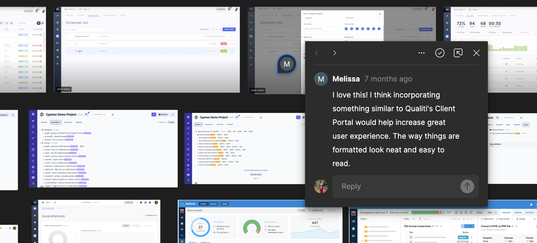
Our team also has two of our own QA Engineers, so I was able to ask them detailed questions about what they liked and disliked about our product, as well as other products and why. In an attempt to get more feedback, I conducted a few usability interviews and sent out surveys to my network.
DESIGN
Wireframing
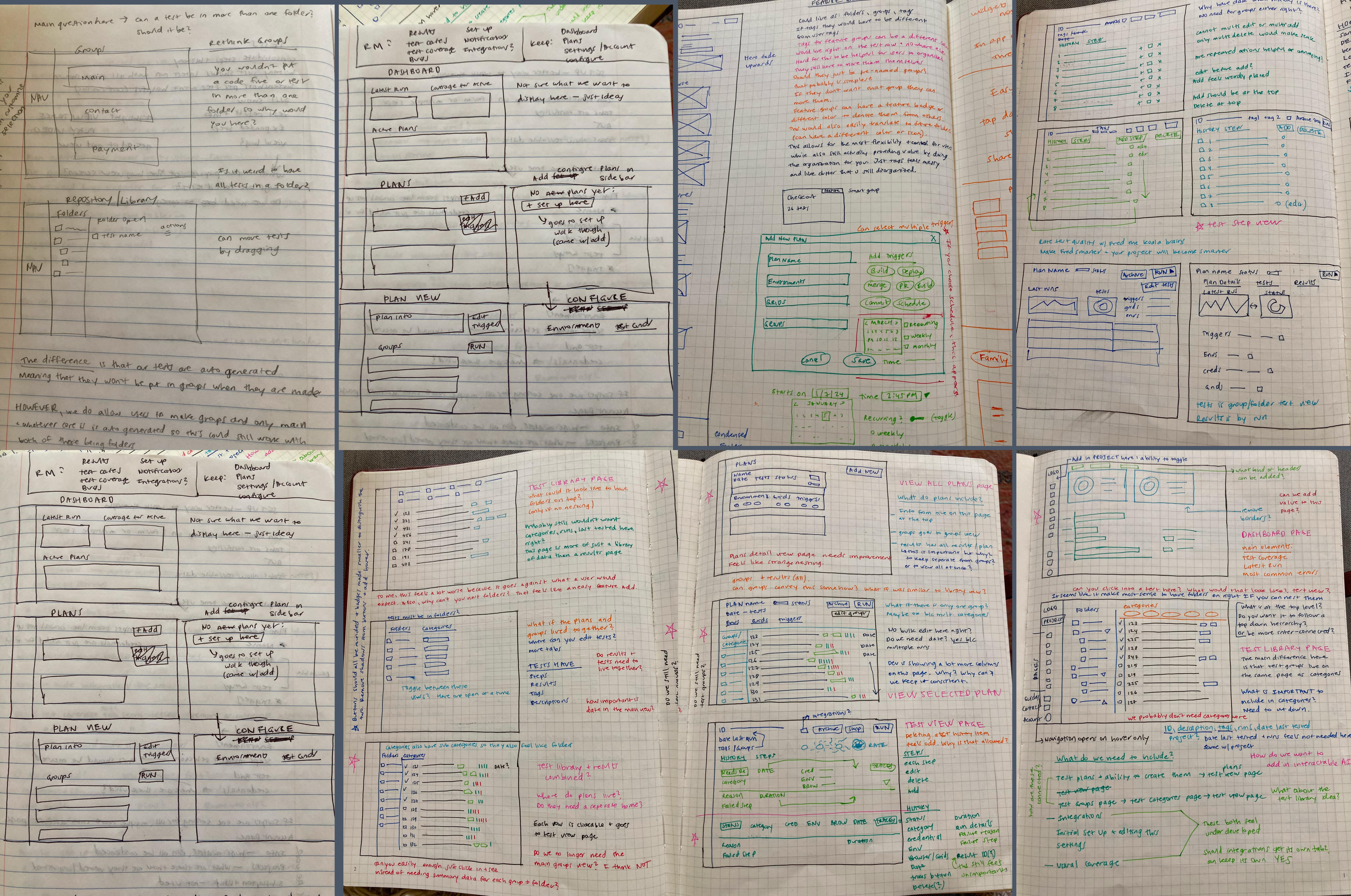
After laying out our new Information Architecture as well as improved user flows, I set to work creating wireframes. I had a lot of questions and notes on how our application works, and took these to the leadership in engineering to better understand our product and our long term goals. I shared my wireframes with different members of the team going through many iterations to get to a version that seemed ready to be refined.
DESIGN
Accessibility
After testing our left navigation and current branding guidelines, I realized that we are failing accessibility standards set by the WCAG. I tested several updated variations of our branding and created a presentation for the CEO showcasing my recommendations. With all of our stakeholders approval, we moved forward with our updated branding as displayed in the new designs.

DESIGN
Design System
Due to being the first designer hired at the company, there were no design guidelines, processes, or systems in place. While creating my prototype screens, I decided to create a Design System. My goal was to establish standards and consistency for our design elements as well as to create reusable components that the engineering team could create and reuse, increasing our efficiency as a company. Learn more about the Eucalyptus Design System here.

FEEDBACK
Prototype Refinement
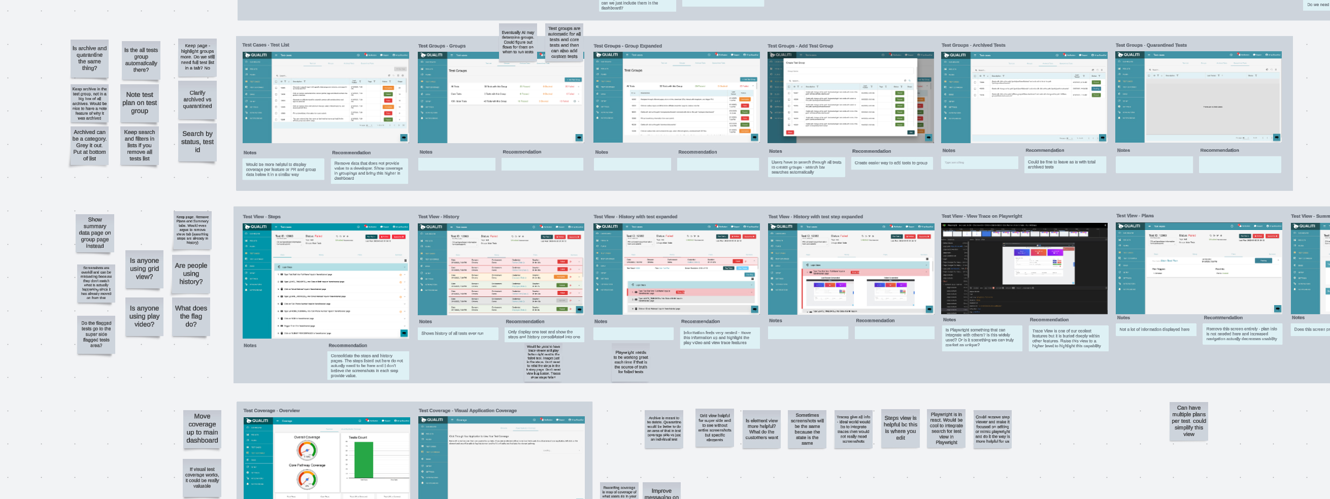
I received feedback that we do not want to include element ID's anywhere in our application except for in individual tests. The ID's were originally meant for internal use only and have no relevance to the user. In improved versions, I removed all IDs and also many table headers that no longer felt useful or relevant. I also learned from our QA team that the test descriptions in the library felt overwhelming. We decided to create titles for test, and show those in the table instead. Lastly, I was told that some pages felt cluttered, so I decided on using a tab view for most pages so that pages felt more contained, organized, and consistent across the application.
BEFORE
AFTER
HANDOFF
Presenting to Developers
Due to my past experience working as a Front End Developer with an early interest in the design process, I always appreciated working with designers who gave me a chance to see upcoming designs and give feedback from a technical perspective ahead of time. At Qualiti, I established biweekly Design/Dev meetings where the focus is on the engineers. I present upcoming designs a few sprints ahead of time, and walkthrough the prototypes while answering questions. I found that this creates a lot of trust and open communication between teams and increases buy in for UI changes.
TAKEAWAYS
Learnings
I learned a lot throughout this process and it was really rewarding to see it through to now being a functional product with the new designs. This was the first big project I worked on at Qualiti and since there was not a design process in place, I had to learn a lot with creating and documenting my Design Process, and how to integrate within the team. I added in the Design/Dev meetings a little bit too late in the process, but once they began I noticed huge improvements with communication and addressing design issues well ahead of time.
Also, from talking to the engineers and being really involved in the sprint process, I learned that sometimes key architectural changes and decisions were missed which then led to work taking longer than expected or needing to rewrite code. I learned to include a section of Technical Change Highlights in my Design/Dev meetings of architectural changes that I know of to ensure they are addressed in Technical Design meetings.
Lastly, I initially started the process with individual files for different designs grouped by sprints. This started to get confusing because work would bleed into later timeframes and it was hard to keep track of what designs were where. Once I started to organize them by the overarching concept (i.e. Test Library), with sub pages relating to different aspects of those designs, it became a lot easier for everyone, myself included.
Next Steps
While we are getting a lot closer to a version of the product that we believe customers will love, we still won't know for sure until we can do usability tests. The goal is to be very hands on with our initial customers who are signing on in the next few months and ask them about their experience and document their feedback as much as possible. We will then analyze the data with affinity maps, prioritize their feedback, and determine next steps based on what the user needs.